The weight of a line in Vagabond's sword fights
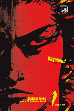
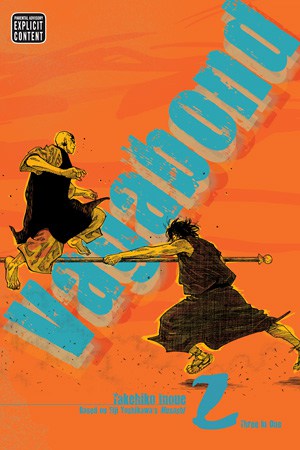
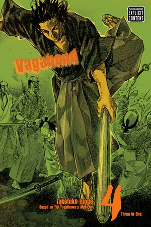
Vagabond’s swordplay gains much of its force from what the page leaves unresolved. Inoue’s changing line, open space, and attention to bodies make an attack feel like a risk unfolding, rather than a clean emblem of mastery.
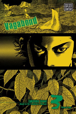
Coverage: Discusses the manga’s visual treatment of swordplay across its early action; no plot outcomes.
A line can carry force without promising control
Vagabond’s drawn strokes rarely make swordplay feel like a diagram with a guaranteed result. A blade’s path may be clear, yet the marks around it can remain rough, forceful, or interrupted. That difference lets the reader grasp the action without mistaking clarity for certainty. The line communicates where a body is moving while preserving the possibility that the movement might fail, meet resistance, or cost more than the figure intended.
The visual effect suits a story in which skill and danger occupy the same instant. A polished, perfectly legible stroke can look like an answer already known; a more unsettled mark keeps the outcome in question. The page asks the eye to register both direction and instability. Swordplay becomes an event rather than a badge of competence, because the image holds onto the strain of committing a body to a motion whose consequences have not yet arrived.
Empty space gives an attack somewhere to go
The open areas around figures and blades are not merely pauses between details. They help establish distance, and distance is part of the threat. When space remains around a combatant, the reader can measure the gap that must be crossed before an attack connects. If that gap feels wide, the body seems exposed during its approach; if it closes quickly, the movement can feel startling. Space therefore participates in the action, shaping how long danger appears to last.
That openness also prevents every panel from becoming a crowded inventory of weapons and limbs. A sparse field gives the important marks room to register, while keeping the eye alert to what has not yet happened. In a sword encounter, absence can make a reader anticipate contact before the page supplies it. The tension lies partly in that interval: the blade is aimed, the opponent is present, but the space between them has not yet been resolved into a wound or a miss.
Bodies make technique feel costly
Vagabond’s combat imagery keeps attention on the body that has to produce a technique. Posture, balance, reach, and the placement of weight all matter because an attack is not a floating sword stroke. It is an action made by a person who can overextend, lose footing, or expose a vulnerable side. By emphasizing physical commitment, the manga makes even a decisive movement feel contingent on the body’s limits and the opponent’s response.
This emphasis resists the temptation to turn combat into a string of elegant poses. A pose can suggest a fighter’s skill, but the transition into and out of it reveals whether skill can survive contact with another person. The reader sees effort as well as form, and that makes violence hard to detach from its consequences. A stroke may be visually forceful while still appearing precarious, since the same commitment that gives it power can leave its maker open.
Uncertainty is the image’s ethical pressure
The visual style does more than make action vivid. By keeping a sword stroke uncertain, it complicates the easy romance of mastery. A fighter may look imposing, but the marks and spaces around him keep the scene from promising that control is absolute. The reader is invited to admire precision while also feeling the risk that accompanies it. That double response matters in a manga concerned with the life of a swordsman: the weapon’s beauty cannot fully conceal what its use demands of human bodies.
The result is a distinctive kind of suspense. We do not only wonder who will win; we watch a decision become physical, and notice how little the image can guarantee about its outcome. Line gives the movement energy, open space preserves its unresolved interval, and bodily emphasis keeps the cost in view. Together, these choices make swordplay feel neither weightless nor preordained. Vagabond’s page can show a stroke with striking clarity while leaving its meaning unsettled, which is why each act of mastery still feels like a wager.
Primary work & further reading
Primary work: Vagabond. Character and story readings are editorial interpretations. The publisher reference below identifies the work and its premise.