Following Akira's motorcycles across the page
Akira’s manga makes motion persuasive by giving it room to cross. Roads, open distance, speed lines, and densely drawn architecture work together to make the city feel traversable, while keeping every burst of momentum tied to a physical place.
Coverage: Opening volume only; discusses roads, scale, motion lines and architectural detail without later destruction spoilers.
Roads give motion a direction
The manga’s sense of speed begins with space that can be crossed. Roads do more than locate the motorcycle gangs in an urban setting; they give movement a visible direction and a destination. The riders can surge along a stretch of pavement, change their relation to one another, and occupy a shared route. That spatial clarity matters. Speed feels convincing when the reader can tell what the bodies and machines are moving through, not only that they are moving quickly.
Roads also make the city part of the action’s rhythm. A long open route allows momentum to gather, while a turn or built-up area changes what movement can mean. Otomo’s compositions use the street as an organizing line: it draws the eye forward, establishes distance, and anchors the riders to a landscape larger than themselves. The result is not a free-floating chase image. It is motion with geography, and geography that makes the city feel usable by the characters.
Scale makes riders look small and fast
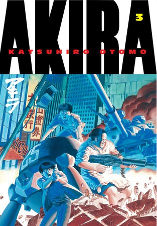
Neo-Tokyo’s architecture provides a countermeasure to the riders’ energy. Large buildings, elevated structures, and broad urban spaces can dwarf the human figures moving among them. That contrast does two things at once: it makes the city feel imposing and gives a fast-moving bike a clear scale against which to register. When a small figure crosses a wide environment, the reader can sense both how quickly it travels and how much space remains around it.
The architecture also gives the page a sense of depth. Background detail is not merely decoration behind the foreground action; it helps establish layers of distance and place. A building’s face or a road’s span can carry the eye beyond the immediate figures, making the urban setting feel continuous. The riders’ speed then belongs to a world that extends past the panel’s central action. The city appears not as a flat backdrop but as a substantial environment that can be entered, crossed, and temporarily dominated by movement.
Graphic marks translate velocity
Motion lines and directional compositions make speed legible through graphic shorthand. A drawn line can suggest the rush of a vehicle, but it works best when the surrounding forms clarify the movement it emphasizes. The manga pairs such marks with recognizable bodies, machines, and surfaces, so the reader can connect velocity to an object and a path. Speed is not an abstract effect pasted over the scene; it is a way of seeing a specific movement more intensely.
The contrast between precise architecture and loosened motion gives those marks added force. Buildings and streets can be rendered with a density that encourages the eye to inspect their edges. Against that stable detail, movement feels like a disruption of the page’s order. The reader’s gaze is pulled away from careful observation and sent along the path of action. That change in reading pace is part of the effect: the drawing does not only show characters moving fast; it briefly makes the reader look faster too.
Detail gives momentum a place to stop
A scene of speed needs more than acceleration. It also needs a sense that movement happens within a world that has surfaces, boundaries, and consequences. Architectural detail supplies that world. The city’s structures give the eye points of reference, making shifts in distance and direction easier to feel. Because the setting is drawn with attention, the riders never seem to travel through blank space. Even a rapid sequence remains attached to the material environment surrounding them.
That attachment keeps the visual excitement from becoming generic. Roads establish routes; buildings establish scale; motion marks carry the eye across the distance between them. Each element contributes a different part of the sensation, and none alone would be enough. Akira’s speed on the page comes from the relationship among them: a city substantial enough to resist being reduced to a backdrop, and movement forceful enough to redraw how the reader sees it. The page makes velocity vivid by giving it space—and giving that space shape.
Primary work & further reading
Primary work: Akira. Character and story readings are editorial interpretations. The publisher reference below identifies the work and its premise.