Undertale's interface makes the player pay attention
Undertale’s menus and combat presentation keep decisions visible at the moment they matter. By pairing readable choice labels with attacks the player must dodge directly, the interface makes attention part of play.
Coverage: Covers early combat patterns, battle menus, and interface communication; excludes major meta twists and endings.
The menu makes intention explicit
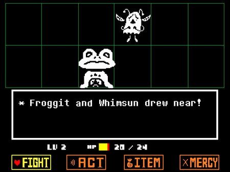
Undertale’s battle interface puts a small set of choices in front of the player and asks them to select an intention. The labels for actions such as FIGHT, ACT, ITEM, and MERCY make the menu’s structure easy to grasp, but the commands do not all describe the same kind of response. One directs force, another invites a specific interaction, another uses what the player carries, and another seeks an end to the encounter. The visible menu turns a vague feeling of what to do into a choice the player has to own.
That clarity has an interpretive effect. Because the options sit together, the game does not hide nonviolent action behind an obscure system or a special mode. A player can see that combat contains more than attacking, even before knowing how every command will work. The interface asks the player to compare intentions rather than follow a single expected path. Its simplicity is not a lack of meaning; it is a way of making the difference between possible responses difficult to ignore.
Dodging makes attention physical
When an enemy attacks, the player controls a heart and avoids incoming patterns. That shift from selecting a command to moving under pressure changes attention from a general virtue into an immediate task. The player has to watch where projectiles travel, how patterns fill the space, and where the heart can move safely. The screen communicates danger through motion and shape, while the player’s control makes each observation consequential. A battle cannot be handled only by reading menus; it also demands active visual attention.
The contrast between menu and dodge phase gives encounters a distinctive rhythm. First, the player chooses what to do; then the enemy’s attack asks them to respond with movement. Those are different forms of participation, and the game places them side by side. The menu gives time to consider a response, while the projectile patterns make survival depend on noticing what is happening now. This rhythm helps explain why a battle can feel personal even when its visual field is spare: the player is repeatedly asked to make a choice and then meet its immediate pressure.
Labels carry a tone
The interface communicates through presentation as well as mechanics. Its compact, consistent arrangement keeps the menu legible, while the distinct words for commands give each option a tone before the player has tested it. ACT sounds like engagement with the opponent; MERCY names a possible attitude toward the fight; FIGHT makes violence an explicit selection. The labels do not dictate what the player must choose, but they make the available intentions visible. A menu can therefore carry ethical weight without becoming a lecture.
That weight is sharpened by the game’s use of enemy behavior. A player may choose ACT, then encounter a response that suggests whether the attempt mattered. The command is not a magic answer; it begins an exchange in which the opponent remains present. In this way the interface makes attention relational. The player is asked to connect the name of an action with the creature’s behavior and then observe the outcome. Reading the labels matters, but reading the encounter matters just as much.
Clarity gives choice its force
The interface’s directness helps the player understand responsibility at a useful scale. A command is selected from a visible menu; a pattern appears in a defined space; movement determines whether the heart avoids it. The game does not need a dense display of hidden numbers to make the player feel involved. It makes relevant information perceptible and asks for a response. That design creates room for learning while keeping mistakes attached to choices the player can recognize.
Undertale’s interface makes the player pay attention because its parts keep returning attention to the encounter. Menu labels ask what kind of action the player intends; bullet patterns ask what danger is present; enemy responses ask whether the chosen action made a difference. Each element has a practical function, but together they shape a way of playing based on noticing and interpreting. The interface is not just a frame around the story. It is where the player’s decisions become legible, giving even a small menu choice the force of a considered response.
Primary work & further reading
Primary work: Undertale. Character and story readings are editorial interpretations. The publisher reference below identifies the work and its premise.