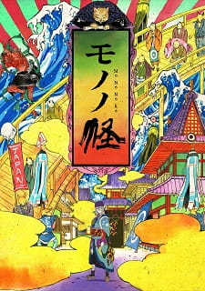
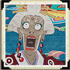
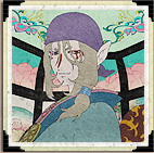
A room drawn like a trap in Mononoke
Mononoke’s paper-like surfaces and compressed spaces make looking feel unsettled. Its visual flatness does not simplify the world; it turns color, pattern, and perspective into clues about how safety can fail.
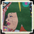
Coverage: Discusses the visual style across the 2007 TV series without identifying individual arc resolutions.
A surface that refuses to settle
Mononoke often makes a room look less like a window onto a realistic space than a printed surface assembled from color and pattern. Walls, screens, clothing, and decorative motifs can press forward with comparable visual force. The result is strikingly flat, but not calm. When ordinary depth cues recede, the eye has fewer places to rest; a patterned surface may feel as active as the figure standing in front of it. The room becomes something to read, not merely inhabit.
That choice changes how threat registers. A conventional shadow might announce danger by hiding what waits beyond it. Here, danger can arrive through an excess of visible detail: a motif that seems to crowd the frame, a boundary that draws attention, or a sharply different patch of color. The viewer is not simply waiting for something to emerge from darkness. We are learning to distrust the visible world’s decorative order, because its surfaces can make unease present before a clear cause appears.
Pattern makes the setting participate
Patterns in Mononoke do more than identify a space as traditionally styled or visually ornate. Their repetition gives a room a rhythm, and that rhythm can feel regulating at first. Repeated lines and shapes imply a composed environment, one with rules and familiar arrangements. Yet repetition also makes irregularities more noticeable. A break, interruption, or uneasy relation between a figure and the surrounding pattern can register as pressure even before the viewer knows what it means.
This is why decoration can carry suspense without functioning as a simple clue with a fixed answer. Pattern affects attention rather than translating neatly into a message. It can make a character appear caught within a design or turn an apparently settled room into a field that seems to close around them. The style asks viewers to notice how a place organizes what can be seen. Threat is not always an intruder crossing a threshold; sometimes the environment itself feels implicated in the unease.
Perspective denies an easy refuge
Perspective in the series can make familiar spaces feel unreliable. A room may not read as a stable box whose dimensions and sightlines are easy to grasp. Instead, flattened planes and emphatic edges compete with the expectation that objects should recede in orderly fashion. The viewer may understand the basic arrangement of a scene while still feeling that its space does not behave like a comfortable, measurable interior. That tension gives conversation and investigation a visual uneasiness of their own.
The effect matters because these stories often place pressure on what characters can know. If a space feels unstable, watching becomes an active process rather than a passive survey. The eye follows borders, compares layers, and tries to make coherent depth from conflicting signals. This is not the same as being unable to understand the image. Mononoke remains deliberate and legible in its own terms, but it withholds the reassuring neutrality of naturalistic perspective. Seeing clearly does not necessarily mean feeling secure.
Color turns attention into sensation
Color supplies another way for the series to guide attention without relying on realism. Strong contrasts can make parts of an image feel immediate, while broad fields of color give the frame a graphic force that ordinary lighting would soften. The visual result is not simply beautiful decoration attached to a frightening story. Color affects the viewer’s sense of distance and emphasis, making a figure, object, or boundary feel conspicuous in relation to its surroundings.
Together, flatness, pattern, perspective, and color make the setting part of the viewing experience rather than a neutral backdrop. Their value lies in how they alter attention: a room can be vivid and still feel inhospitable; a clear image can still leave its space hard to trust. That combination suits Mononoke’s mysteries, where appearance is essential but never sufficient. The style does not need to conceal everything to make a scene dangerous. It can show the room in full and still make looking feel like entering uncertain ground.
Primary work & further reading
Primary work: Mononoke. Character and story readings are editorial interpretations. The publisher reference below identifies the work and its premise.